
公司新开项目,所以很多东西可以重新规范化起来(原来的旧项目经历各种水平参差不齐的人修改,以及无 eslint 等,已经不堪入目),我主动将 button 组件揽下,之前一直没有机会去写这样的组件,正好借此机会学习学习。(由于是 uniapp 的项目,所以在使用方面也是遵循 uniapp)
一、如何设计组件样式
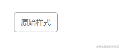
大型的 UI 框架都有一个基本的设计原则跟规范,那么我们在设计组件的时候,也需要这样的东西。最直接的,就是通过跟 UI 沟通,确定好 button 组件的样式,如颜色、大小、形状等。那么我们就可以得出下面的基本样式(注:往后的样式中带&都是写在 zc-button 里面):
1 | |
由于 uniapp 的 button 会有一些原来的样式,所以为了妨碍我们的设计,我们需要重置这些样式并修改部分样式:
1 | |
在 tempalte 方面,我们的现阶段的内容如下:
1 | |
那么在基础样式方面,我们就完成了全部的设计,接下来就是对其他内容的补充。
1、颜色
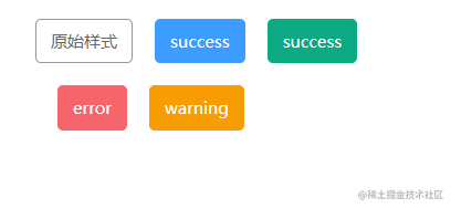
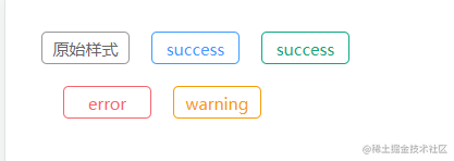
在上面的基础样式补充之后,只会出现一个只有文字的 button,那么我们需要先丰富颜色这块的内容。我们定义了五种颜色选项,分别是:
default、primary、success、error、warning。对于 default 很简单,只需要下面写即可:
1 | |
效果如下:
对于其他颜色来说,字体颜色是白色,那么背景色以及边框颜色是一样的,这时候就可以利用 scss 的@minin。
1 | |
那么其他颜色就可以写成下面的方式:
1 | |
那么效果如下:
除此以外,我们的项目设计稿还有一种叫做镂空的按钮,具体设计样式如下:
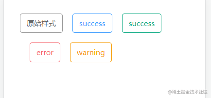
实现起来也是比较简单,如下:
1 | |
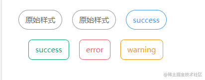
2、按钮大小
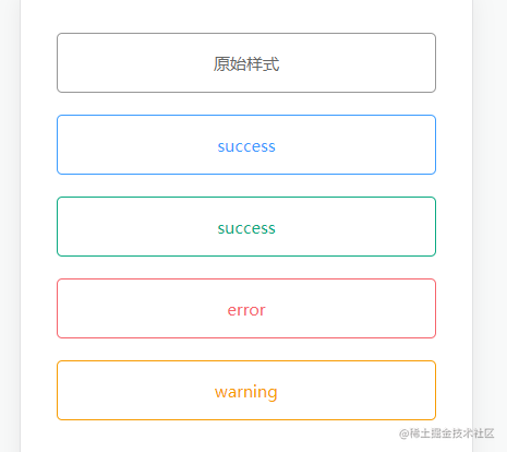
项目的设计,按钮主要是有三种,大,普通,小。在设计大按钮的时候,我们喜欢按钮独占一行,并且占满屏幕,如下:
1 | |
效果如下(为了演示,父元素设置了padding):
小的效果无差,就是稍微缩小一点:
1 | |
效果:
3、形状
这个没啥好提,就是按照设计稿来设计即可:
1 | |
效果:
至此,已完成了 button 组件的样式设计,下面来看看如何整合这些样式。
二、如何整合组件样式
其实组合这些样式比较简单,首先我们先给现有的属性列一下 props:
1 | |
其实就分成两类,一种是多属性如:type、size、shape。一种是布尔值的如:plain。两种类型可以分开实现,比如多属性的,我们可以遍历的方式组合,如:
1 | |
而布尔值类型的则需要判断过后才能决定是否添加 class。那么我们就可以得到下面的 Function:
1 | |
接着我们再写一个computed,如下:
1 | |
为什么要写computed呢?因为绑定的时候不需要执行,而写函数的话,需要多写两个括号执行(有理有据,令人信服)。
三、还有其他松散的东西
比如 button 都会有
disabled、loading、这些还是比较简单的,因为原来的 uniapp 里面的 button 组件就有的属性,我们只需要传值就行了。有的时候,我们也需要提供 text 的属性,也就是如下:
1 | |
这在很多 UI 库都会有相关的属性提供,是为了保证组件直接使用,不必都要写插槽写进文字。插槽的作用就不用多说了,直接是提供对内容的改造,比如可以在里面添加 icon 等。
- 有时候还需要提供 button 样式修改能力,这样就可以让使用者写出
五彩斑斓黑的按钮,我们需要做点改动:
1 | |
无他为手熟尔~
总结
至此,一个通用化 button 组件就完成了。这个组件的设计大致可以总结到下面步骤:
- 确定组件的需求。我这个组件还是比较简单的,没有过多的样式设计,可以参考 ElementUI 等框架,他们 button 组件能力远远不止这些。
- 设计组件的实现。咱这个设计,相信大部分人都可以搞的出来,因为难度其实没多少,代码实现也简单,要说有点难度的,我觉得最多是 css。
最后我说一句,不要因为参考了别人库的组件设计,就打算跟别人设计的差不多,还得要按照实际需求出发,因为多余的功能你真用不上,而且还有可能费时费力。而且组件都是在实际使用中,慢慢完善的,那些 UI 库也是如此。好了,祝大家金三银四跳槽顺利。